Design Basics
Let's make your project look nice!
Why it matters?
You may have no design training or experience, and of course, your goal at Get Building is not to become a designer. However, there are two important reasons why you should strive to learn the basics of good design.
- You’ll be judged by the appearance of your projects. Even if your code is impeccable, if your project doesn’t look great, it could distract potential employers from fully appreciating your wonderful code.
- You will work with designers. Once you score a job, it’s very likely you will be handed designs and asked to make them a reality. If you understand core design concepts, you’ll be better able to code designs, provide better feedback to designers, and ultimately make everyone’s life easier (including your own).
Before You Start
When beginning a project, before writing a single line of code, you should do a little research, and answer a couple important questions.
Who Is Your Audience?
Nothing is more important than this question, and it should drive everything you do. From what platforms you develop on, to what colors you use, to how the project operates, every decision should assist in giving your target user the fastest, easiest, and best looking experience possible.
Mobile, Desktop, or Both?
What platform would your audience want to use your application on? While some circumstances may call for a desktop only project, most often a mobile version will be required. If so, BUILD THE MOBILE VERSION FIRST. If you get something working within the limitations of mobile, then it should be relatively easy to get it working on desktop. It’s so much harder to adapt things when moving in the other direction, so make things easy on yourself and just don’t do it.
Make User Testing Part of the Process
It’s critical that throughout the development of your project, you test it with people who represent your target audience. If you’re developing a children’s game, give it to children to play! If you’re building an event planning tool, let a wedding planner test it! Your target audience, and ONLY your target audience, will give you the feedback you need to make your project operate as efficiently as possible.
Pro Tip: Friends or family members may be reluctant to give you an honest opinion if they don’t like something about your project. When asking for feedback, if possible, tell them the work is not yours, and they’re free to give whatever feedback they want. If they know it’s your work, at least reiterate that you will not be offended if they don’t like something about it. The only feedback that can improve your work is honest feedback, so you have to be willing to hear both the good and the bad.Build a Solid Design Foundation
Simply put, don’t attempt to reinvent the wheel. The idea here is for you to build competent looking projects, not to be on the bleeding edge of design and interaction. Don’t worry about using canned color schemes, icon libraries, suggested font pairings, or pre-built elements. Rely on suggestions and assets from professional designers so you can focus your efforts on writing great code.
Color
Think of your project as a brand. What color would define your brand? Is your project a utility or e-commerce app? Blue might be a good choice. Is it a children’s game? Perhaps something more playful like purple or orange. Start with a single color that makes sense for your project, and then plug that color into a color scheme generator. Choose more vibrant colors for playful apps, more muted colors for utility apps, but limit the palette to about 2-4 colors. Define what elements get what colors (i.e. one color for primary buttons, another for secondary buttons) and keep it consistent across the entire project.

Additional Resources:
Font
Again, what fonts make sense for your “brand”? Consult online resources and grab a font pairing. Using one bolder font for headers and titles, and a simpler font for body text usually yields the best results. But whatever you pick, make sure it’s easy to read. Even if your brand calls for something “fancy”, don’t pick anything that requires even a little extra thought to understand. It should be instantly readable to anyone.

Additional Resources:
- Tons of free fonts available at Google Fonts.
- Great article with more info on fonts, and a bunch of nice font pairings here.
Buttons, Forms, & Other UI Elements
Try to stay away from gimmicks, but make sure you’re using modern methods and styles when building project elements. Need a button, dropdown, or list? Don’t build just anything. View websites and apps from top brands, or hit up design websites for inspiration on the best way to style the elements you need.

Additional Resources:
Dribbble is a great place to view sample work from designers, and get ideas on how to tackle individual UI elements, or entire screens/pages.Iconography
Iconography can help a user quickly find things within your UI, inform a user what something does, and inject some personality into your designs. With that said, using a hodge-podge of icon styles and sizes can make things messy, and give an impression that things were just “thrown together”. Always strive to use icons that have the same style (i.e. filled vs outlined) and same weight (i.e. thin lines vs thick lines).

Additionally, unless your icon is a universally understood symbol (i.e triangle for “Play”), you’ll almost always want to pair your icons with text to give your user context.

Unless you’re able to build your own icons in applications like Adobe Photoshop or Figma, it’s best to grab icons from pre-built libraries.
Font Libraries:
Core Concepts
Hierarchy
It’s impossible for a user to focus on every element on screen at once. It’s critical to guide their eyes, allowing them to quickly scan the UI, and focus on the important things first.
Elements like header text and primary action buttons should stand out immediately. Things like secondary actions should be more subdued, so they can be focused on when or if the user needs to.
Hierarchy can be achieved using a few different concepts, and while some of this may seem obvious, these simple ideas are often not adhered to.

Size
This is the most obvious to any user. Large text or buttons will command attention

Color / Contrast
Bold colors and high levels of contrast between elements and their background will demand attention. It’s also important to use enough contrast to meet accessibility standards, so that any user will be able to see and read text within your UI.

Space
Space is important for two reasons. Firstly, things that are closer together will be assumed to be related. So placing things with correct proximity will help create digestible “chunks” of content.

Secondly, using a lot of white space gives content and elements room to breath. This again allows the user to better scan your design, but also helps create a more premium feel.


Alignment
Things that are aligned will be easier for the eye to scan and process. The more things you can have sharing visual “planes”, the cleaner your UI will appear. Because of this, left alignment of body text and other elements is often preferable. Depending on the context, a line or two of text can look nice centered, but never center a paragraph of text!

Weight
Icons, text, and other elements that have thick lines will stand out against thinner elements (i.e. bold vs regular text)

Consistency
When starting your project, clearly define your color scheme, fonts, spacing and styles for things like buttons, forms, etc., and then reuse those same styles throughout the entire design. Even if only on a subconscious level, users will notice things like buttons changing size or color from one screen to the next. Maintaining a consistent style throughout your design is critical to giving it a professional and polished feel.

Simplicity
When it comes to UI design, it’s almost always the case that less is more. On any given screen in your UI, it should be immediately obvious to the user what the primary actions are, and what the user should do. Put another way, when your user first opens your project, they should be able to easily answer these questions:
- What does it do?
- What does it want me to do?
- What do I do first?
- What happens next?

In order to keep things simple and straightforward, it’s often better to break a workflow over multiple screens/sections, versus packing everything together. It may seem counter intuitive, but a user will get less frustrated by multiple simple steps, versus one complicated step. Think of how your average checkout process breaks personal info, shipping info, payment info, and confirmation steps out over multiple screens, rather than cramming all of those things together.
Core Elements
The goal of this UI/UX crash course is to give you some simple, high level concepts to help you design. However, some UI elements turn up in so many Get Building projects that they warrant a little more detailed discussion.
Navigation

- Put links/buttons in familiar (and in the case of mobile, easy to reach) locations
- Give links descriptive versus generic names
- Ensure navigation choices are ordered to put the most critical links first
- Ensure your navigation layouts make sense for the platform (Often you will need a different style of navigation for mobile versus desktop)
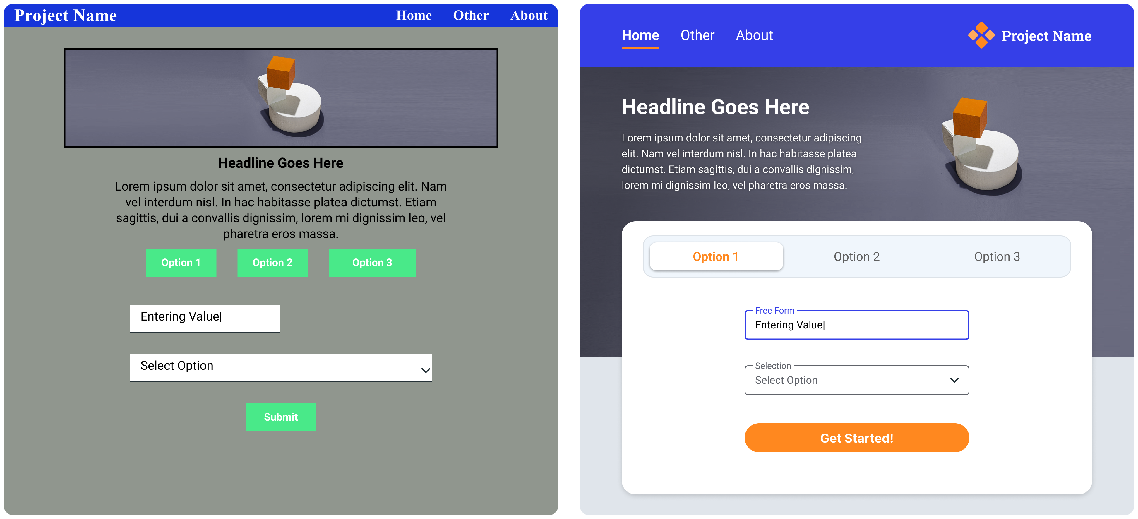
Buttons

- Use modern styling (no gross drop shadows and gradients)
- Use consistent styling throughout entire design
- Use clear labeling (user should have no doubt what happens when they click)
- Use hierarchy (primary vs secondary buttons)
Forms

- Use modern and consistent styling
- Titles for forms should always be visible (don’t only use text inside the form)
- Ensure your forms have default, selected, inactive, or error styles when necessary
Tables

- Use modern styling
- Don’t draw every line. Use space, color, and weight to help chunk up data
- Use alternating shading on very long/ text heavy rows
- Only include the necessary data (does a number actually need to show 7 decimal places?)
- Left align all table contents to make it easier to scan and read
Cards

- Effective and aesthetically pleasing way to chunk data together, especially on a greyscale or colored background.
- Use consistent styling (corner radius, padding, etc.) throughout design
Closing Thoughts
There is so much to learn and keep up on in the realm of UI design, so if all this feels a little overwhelming, that’s understandable. It’s encouraged that as you build your project, you refer back to these design concepts to make sure you’re following good practices.
But when in doubt, perhaps the best thing you can do to help you build efficient and beautiful projects is to look to world class apps and websites for inspiration as often as you can. Allow the work of professional designers to guide your hand in making design choices, so you can focus your efforts on writing fantastic code.